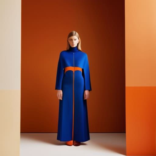
I spent three hours last Tuesday staring at a pile of deadstock heavy jersey, trying to figure out why a specific mustard yellow looked intentional against a forest green, but ended up looking like a total accident once I actually cut the panels. Everyone on my feed acts like colour blocking and coordination is this mystical, high-fashion math problem that requires a mood board and a degree, but most of the time, it’s just people ignoring how light hits different fabric weights. You can pick the most “on-trend” palette in the world, but if your navy panel is a flimsy single jersey and your cream base is a 400 GSM fleece, the whole silhouette is going to look cheap and disjointed before you even pull it on.
I’m not here to give you a list of “must-have” seasonal palettes that will be landfill by next autumn. Instead, I want to talk about the actual mechanics of how colors interact with texture and drape. I’m going to show you how to master colour blocking and coordination by looking at the technical stuff—like dye lots and seam tension—so your pieces actually hold their shape and look like they were built, not just patched together.
Using the Colour Wheel Beyond Surface Level Aesthetics
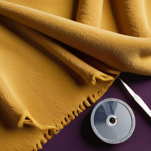
Most people look at a colour wheel and think it’s just a tool for picking two shades that don’t clash, but if you’re actually building a garment, it’s a lot more technical than that. When I’m sitting at my cutting table, I’m not just thinking about what looks “cool”; I’m thinking about how using the colour wheel can actually manipulate the perceived weight of a piece. If you take high-contrast colour combinations—like a heavy mustard fleece paired with a deep violet nylon—you aren’t just making a statement; you’re playing with how the eye perceives the silhouette.
The real trap is getting stuck in the “safe” zone of basic complementary colour schemes. It’s easy to slap orange against blue and call it a day, but that’s how you end up with something that looks like a cheap uniform rather than a designed garment. I find that the most interesting work happens when you move away from the obvious and start looking at analogous shifts or even borrowing a bit of logic from interior design colour theory to find those muted, sophisticated undertones. It’s about balance, not just brightness.
Mastering High Contrast Colour Combinations for Impact
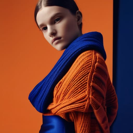
Look, if you want to go loud, go all in, but don’t let the colors fight each other for dominance in a way that looks messy rather than intentional. When we talk about high contrast colour combinations, most people just think about slapping orange against blue and calling it a day. While that’s the textbook definition of using complementary colour schemes, the real trick is managing the visual weight. If you’re pairing a heavy, saturated cobalt with a bright tangerine, you need to consider the fabric textures. A chunky knit in one color and a silk slip in the other will hit the eye differently, even if the theory is sound.
I’ve seen so many “statement” pieces fail because the designer forgot that contrast isn’t just about hue—it’s about value. If you’re working with high-contrast pairings, try to balance the intensity. If one panel is a jarring, high-chroma red, maybe let the coordinating piece be a deep, muted burgundy or a heavy charcoal. It keeps the impact without making the garment look like a mistake. Focus on the tension between the shades rather than just chasing the brightest pigments in the shop.
The Stuff They Don't Tell You in Design School
- Stop ignoring fabric weight; if you’re blocking a heavy 400 GSM fleece against a thin jersey, that seam is going to drag and look like a disaster no matter how “correct” the color theory is.
- Check your dye lots before you commit to a block; a “matching” navy panel and navy base can look like two different colors if one was milled a week later than the other.
- Use your seam allowance as a buffer; when you’re working with high-contrast blocks, a tiny shift in the sewing machine can make the color boundary look crooked and amateur.
- Don’t just look at the swatch; hold the finished garment inside out to see how the color interaction changes when the light hits the grain of the fabric differently.
- Think about the “visual weight” of the colors, not just the hue—a bright neon block will visually “pull” more than a dark earth tone, so place your heavy hitters where you actually want the eye to land.
The Real-World Checklist
Stop obsessing over whether colors “match” on a screen and start checking how they interact with your fabric weight; a high-contrast color block only looks intentional if the seam between those two different weights isn’t puckering or pulling.
Treat color coordination as a structural tool rather than just a decorative one—use your palette to direct the eye toward the garment’s construction, like a well-placed panel that highlights a unique silhouette or a specific seam line.
Before you commit to a bold, multi-colored blocking scheme, look at the garment inside out; if the color coordination relies on a print that ruins the drape or makes the fabric feel stiff and cheap, the “aesthetic” isn’t worth the loss in quality.
Frequently Asked Questions
If I'm mixing high-contrast colors, how do I stop the seams from looking messy or puckered where the different fabric weights meet?
This is exactly where the “aesthetic” meets the reality of construction. If you’re pairing a heavy 400 GSM fleece with a thin jersey, that seam is going to fight you. My rule? Match your weights or compensate. If you can’t, use a stay tape or a slightly wider seam allowance to stabilize the lighter side. And for the love of god, check your tension; high-contrast seams draw the eye right to any puckering.
Can I actually use color blocking to hide a bad pattern cut, or am I just making the construction errors more obvious?
Honestly? You’re probably just making the errors more obvious. Color blocking is basically high-definition for your construction. When you join two different colored panels, that seam becomes a literal roadmap. If your grainline is off or your seam allowance is wonky, the contrast will highlight every single pucker and twist. Use color to design, not to hide. If the pattern is bad, no amount of clever blocking is going to save the silhouette.
How do I balance bold color blocks without the whole garment feeling like a cheap costume or losing the actual silhouette?
The trick is to stop treating color like a sticker you slap on top and start treating it like part of the construction. If you’re using heavy, high-contrast blocks, you have to account for the seam tension. If one panel is a stiff heavy canvas and the other is a flimsy jersey, the silhouette will collapse or pucker like a mess. Balance the visual weight by matching fabric weights, so the color follows the shape, not the other way around.