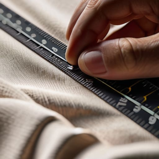
I still remember the first time I tried to scale my little shirt project, thinking I could just “eye it” and call it a day. I ended up with a whole batch of heavy, 300 GSM blanks where the graphics sat so low they looked like they were sliding off the wearer’s hips. It was a total gut punch to see all that money and good ink wasted just because I hadn’t actually sat down to learn real print placement standards. People in this industry love to talk about “vibe” and “aesthetic,” but if your design is sitting two inches too low or off-center, it doesn’t matter how cool the art is—the garment is going to look cheap.
I’m not here to give you a lecture on high-level manufacturing theory or sell you on some overpriced software. Instead, I want to show you the actual math and the physical reality of how to get it right every single time. We’re going to talk about measuring from the collar, accounting for seam allowance, and why precision is the only thing that separates a professional garment from a DIY mistake.
Mastering Apparel Printing Specifications Over Trendy Guesswork
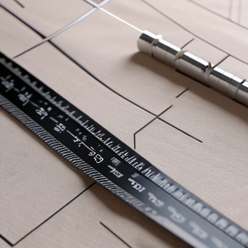
Look, I’ve seen so many “creative directors” walk into a studio with a vibe and a mood board, expecting magic to happen without actually knowing their measurements. But vibes don’t translate to a production run. If you aren’t working with concrete apparel printing specifications, you aren’t designing a garment; you’re just playing a very expensive game of chance. I spent my first year in the studio watching beautiful, high-GSM blanks get ruined because someone thought a graphic “looked better” two inches lower than the spec sheet suggested.
To avoid that heartbreak, you have to respect the math. You need to establish clear print area safety zones so your design doesn’t end up getting swallowed by a collar or lost in a side seam. It’s about more than just centering a logo; it’s about understanding how the fabric hangs once it’s on a human body. Once you stop relying on “eyeballing it” and start using standardized print dimensions, you actually gain control over the final product. That’s the difference between a piece that feels intentional and one that just looks like a mistake.
Why Print Area Safety Zones Save Your Profit Margins
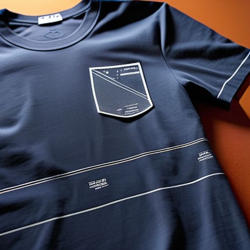
Look, I’ve seen too many small brands burn through their entire production budget because they thought they could “eye it” during the setup. When you’re working with high-quality blanks, every mistake is a literal subtraction from your bank account. This is where print area safety zones become your best friend. If your graphic is sitting too close to a collar or a side seam, you aren’t just risking a weird-looking shirt; you’re risking a garment that’s completely unsellable. One slight shift in the screen and suddenly your centerpiece is swallowed by the armpit.
Establishing strict graphic design print margins isn’t about being a perfectionist—it’s about survival. If you don’t build a buffer into your files, you’re leaving your profit margins at the mercy of a slightly misaligned pallet or a technician having a bad morning. I’d much rather spend an extra ten minutes double-checking my measurements than spend my weekend crying over a box of wasted, heavy-duty cotton that should have been premium stock but ended up as expensive rags.
5 Ways to Stop Treating Print Placement Like a Coin Toss

- Stop eyeballing the collar. I don’t care if it looks “vibey” to you; if you aren’t measuring a specific distance from the neck ribbing—usually 2 to 3 inches for a standard chest print—you’re going to end up with a shirt that looks like it’s wearing the graphic, rather than the other way around.
- Account for the “curved body” reality. A flat tech pack looks great on a screen, but once that heavy 300 GSM blank hits a human chest, the fabric moves. If you place a massive graphic too low, it’s going to bunch up and distort the second someone actually breathes in it.
- Match your placement to the garment’s weight. If you’re working with a lightweight, drapey jersey, a heavy plastisol print placed too high will pull the whole neckline out of shape. You have to respect the tension between the ink and the knit.
- Standardize your “center” using more than just a visual guess. Use a physical centerline or a jig. If your “center” shifts even half a centimeter between the first and fiftieth shirt, you aren’t making a collection, you’re making a pile of rejects.
- Test your placement on a real person, not just a hanger. Hangers are liars. Put the sample on a body, have them move around, and see if that print sits where it’s supposed to or if it migrates toward the stomach the moment they sit down.
The Real Cost of Getting It Wrong
Stop treating print placement like a “vibe”—if you aren’t measuring from the collar down to the millimeter, you’re just gambling with your blanks.
Safety zones aren’t just suggestions; they are the only thing standing between a professional-looking garment and a print that looks like it’s sliding off the chest.
Precision is cheaper than waste—nailing your specs the first time means you aren’t throwing high-GSM cotton and expensive ink into the scrap bin.
Frequently Asked Questions
How do I actually figure out the "sweet spot" for placement on different necklines without just eyeballing it and hoping for the best?
Stop eyeballing it. If you’re just “winging it,” you’re going to end up with a batch of shirts that look like they were printed by someone wearing goggles. Grab a ruler and find your center line first. For standard crew necks, I usually measure down about 2 to 3 inches from the collar seam to hit that sweet spot. If it’s a heavy-weight blank, you might need to nudge it slightly higher to keep it from looking heavy.
Does the weight of the fabric (GSM) change where I should position the print so it doesn't end up sagging or pulling weirdly?
Absolutely. If you’re working with a lightweight, low-GSM jersey, a heavy plastisol print is going to act like an anchor. It’ll pull the fabric down, creating that awkward, distorted sagging around the chest. For those thinner blanks, I usually suggest smaller, more breathable prints or even water-based inks. On the flip side, a heavy, high-GSM streetwear blank can handle a massive, thick print without breaking a sweat. Don’t let the weight catch you off guard.
If I'm working with oversized or boxy blanks, should I be sticking to standard measurements or do I need to recalibrate everything for the extra room?
If you’re working with boxy or oversized blanks, do not—I repeat, do not—just stick to your standard measurements. If you center a print based on a slim-fit spec, it’s going to look like it’s sliding down the wearer’s chest. You have to recalibrate. With that extra fabric, you need to adjust your vertical placement higher up to account for the dropped shoulder and wider drape, or the whole silhouette just looks messy.