I still remember the first time I tried to run a custom design through a professional screen setup, only to end up with a pile of expensive, wasted blanks because I thought I could just “wing it” with my digital files. I had spent weeks obsessing over the perfect heavyweight cotton, but I completely ignored the technical reality of colour separation for printing. I thought as long as the art looked good on my MacBook, it would translate perfectly to the mesh, but I was dead wrong. Instead of a crisp, layered masterpiece, I got a muddy, bleeding mess that looked like it had been through a heavy wash cycle before it even left the studio.
Look, I’m not here to sell you on some overpriced software or tell you that you need a degree in fine arts to get this right. I want to pull the curtain back on the actual mechanics of the process so you don’t burn your budget on bad prints. I’m going to break down how to prep your files properly, how to think in layers rather than just pixels, and why understanding your ink density is more important than any trendy design you see on TikTok. Let’s get into the actual craft.
The High Cost of a Messy Rgb to Cmyk Conversion
Look, I’ve seen it a hundred times: someone gets a killer design going on their backlit MacBook screen, only to realize the printed version looks like a muddy, desaturated mess. The problem is that your screen is living in the RGB world—all those bright, neon-adjacent vibes that just don’t exist in physical ink. When you jump into an RGB to CMYK conversion without actually checking your values, you aren’t just losing some brightness; you’re losing the soul of the design. If you don’t manually adjust those tones before they hit the prepress stage, you’re basically gambling with your production budget.
It’s not just about the colors looking “off,” either. A sloppy conversion can totally wreck your screen printing color layers. If your files are a chaotic mix of different color profiles, you’ll end up with inconsistent ink density or, even worse, a print that looks amateur on a premium blank. I’d much rather spend an extra hour tweaking my files than watching a batch of high-GSM tees go straight into the scrap bin because the colors turned into a greyish sludge.
Optimizing Your Prepress Workflow Optimization for Better Yields
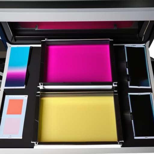
Once you’ve realized that a messy conversion is eating your margins, you have to look at the bigger picture: your entire prepress workflow optimization. It’s not just about fixing one file; it’s about building a system where you aren’t constantly fighting your software. I used to spend hours manually tweaking layers, only to realize I was just masking deeper issues with my setup. If you want to actually scale without losing your mind, you need to standardize how you handle your screen printing color layers from the jump.
A huge part of this is deciding between a full process print and using specific spot color separation techniques. If you’re running a high-end run on heavy cotton, trying to force a complex image through a standard CMYK process often results in muddy colors that just don’t pop. Instead, I’ve found that mapping out your specific inks early on—rather than letting the printer “figure it out”—saves a massive amount of ink and film. It’s about being intentional with your ink coverage before you even touch a screen.
5 ways to stop your print files from becoming a total nightmare
- Stop trusting your screen. Your MacBook Pro is lying to you. Those vibrant, glowing neon colors you see in Photoshop literally cannot exist in the physical world of ink and fabric. Always work in a calibrated CMYK environment from the jump, or you’re going to be staring at a muddy, dull version of your design once it hits the screen.
- Check your line weights like your life depends on it. If you’re running fine-line illustrations, make sure those strokes aren’t so thin that they disappear into the weave of a heavy GSM cotton blank. I’ve seen so many “minimalist” designs turn into nothing but accidental ink splatters because the lines were too spindly for the mesh count.
- Trap your colors or prepare for gaps. If you have two colors sitting right next to each other, you need to build in a tiny bit of overlap (trapping). If you don’t, and the garment shifts even a fraction of a millimeter during the print run, you’ll end up with these annoying, bright white gaps of unprinted fabric that make the whole thing look cheap.
- Don’t forget about the halftone dots. If you’re trying to do a photographic print or a soft gradient, you need to be obsessive about your halftone screen angles. If you mess this up, you’ll get those weird “moiré” patterns—those distracting, wavy geometric shapes—that scream “amateur” to anyone who actually knows how to look at a garment.
- Simplify your spot colors whenever possible. I get it, you want a twelve-color masterpiece, but every extra color means another screen, more setup time, and more chances for registration to fail. If you can achieve a similar vibe by using a clever halftone or a limited palette, do it. Your sanity (and your budget) will thank you.
The Bottom Line: Don't Let Your Files Kill Your Print
Stop treating color separation like an afterthought; if your files aren’t clean before they hit the press, you’re just burning money on wasted ink and ruined blanks.
Respect the shift from RGB to CMYK—if you don’t manually manage those color shifts, you’re going to end up with a print that looks nothing like your screen.
A solid prepress workflow isn’t just “extra work,” it’s the only way to ensure your production actually scales without every single shirt becoming a costly mistake.
Frequently Asked Questions
Do I really need to separate every single color, or can I get away with just a few spot colors to save on ink?
Look, if you’re trying to save a buck on ink, spot colors are your best friend—but don’t let “saving money” turn your print into a muddy mess. If your design has subtle gradients or soft shadows, trying to force those into a few spot colors is going to look cheap. Use spot colors for those punchy, solid hits, but if the art relies on depth, you’ll need more separations to actually respect the original design.
How do I know if my digital colors are actually going to look the same once they hit the actual fabric?
Honestly? You don’t—at least not until you see a strike-off. Screens use light to show you color, but ink uses pigment to sit on top of fibers. It’s a different language entirely. If you aren’t using Pantone Solid Coated guides to bridge that gap, you’re basically just guessing. Don’t trust your MacBook’s brightness; trust a physical swatch. Always, always ask for a sample print on your actual blank before you commit to a full run.
Is it worth spending hours perfecting my separations if I'm just printing on a budget blank anyway?
Look, I get the logic—why waste time on a premium file for a cheap, scratchy tee? But honestly? It’s still worth it. A messy separation doesn’t just look bad on a heavy GSM blank; it looks amateur on everything. If your colors are muddy or your registration is off, you’re just masking bad craft with bad technicals. Even on a budget blank, clean separations make the print pop instead of looking like a mistake.