I was hunched over a heavy-duty industrial sewing machine last Tuesday, trying to piece together a sample using a massive 450 GSM fleece and a scrap of paper-thin, silk-blend jersey, when it finally clicked. Most “style gurus” on my feed will tell you that texture mixing in outfits is all about following some seasonal color palette or buying a specific expensive linen shirt, but they’re completely ignoring the physics of it. If you don’t understand how weight and surface tension interact, you aren’t building a look; you’re just layering laundry.
I’m not here to sell you on a trend or tell you that you need a whole new wardrobe to look “elevated.” Instead, I want to talk about the actual mechanics of how different fabrics play together. I’m going to show you how to use contrast—like pairing a rugged, boiled wool with a smooth, high-twist cotton—to create a silhouette that actually has some structural integrity. We’re skipping the hype and getting straight into the grit of how to build an outfit that looks intentional because the fabrics actually work for each other.
Adding Visual Depth to Clothing Through Fabric Weight
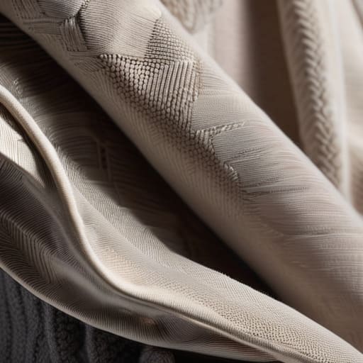
When you’re looking at a flat, single-weight outfit, it usually looks like you just threw on whatever was at the top of the laundry pile. To actually achieve adding visual depth to clothing, you have to stop thinking about colors and start thinking about gravity. I’m talking about the way a heavy, 400 GSM French Terry hoodie sits against a lighter, more fluid base layer. If everything you’re wearing has the same density, you lose the silhouette entirely. You end up looking like a shapeless blob rather than someone who actually understands how clothes are constructed.
The real magic happens when you lean into tactile elements in fashion design by pairing extremes. Think about the structural difference between a stiff, heavy denim and a soft, drapey jersey. When you layer a structured work jacket over a lightweight tee, you aren’t just “dressing up”—you’re creating a physical architecture for your body. This isn’t about following a trend; it’s about using the weight of the textile to command space. If you want to master monochromatic outfit texture layering, stop worrying about the shade of grey and start obsessing over how the light hits a rugged canvas versus a smooth poplin.
The Science of Tactile Elements in Fashion Design
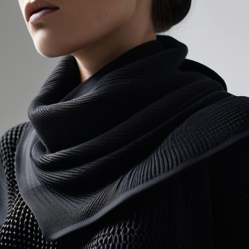
When we talk about the science of how clothes feel against the skin, we’re really talking about how light interacts with the surface of a fiber. It’s not just magic; it’s physics. A flat, matte cotton jersey absorbs light, making it look dense and grounded, whereas a high-sheen silk reflects it, creating a sense of movement. If you’re trying to master monochromatic outfit texture layering, you have to stop thinking about color and start thinking about light absorption. If every piece in your all-black fit has the same finish, you aren’t wearing an outfit; you’re wearing a shadow.
This is where true tactile elements in fashion design come into play. To create a silhouette that actually has some life to it, you need to play with the structural integrity of your materials. I always tell people that a successful look relies on the tension between different weaves. Think about the way a heavy, structured denim interacts with a fluid, lightweight crepe. You’re essentially using the physical properties of the textile to sculpt the way the fabric drapes around your body, ensuring the garment doesn’t just hang there, but actually holds a shape.
Stop Playing it Safe: 5 Ways to Actually Mix Textures Without Looking Like a Mess
- Respect the GSM hierarchy. If you’re layering, don’t try to put a paper-thin, low-quality jersey over a heavy, 400 GSM fleece; the thin fabric will just bunch up and look ridiculous. Aim for a progression where the heavier, more structured fabrics act as your base or your outer shell, and the lighter textures sit in between.
- Contrast your surfaces to avoid the “uniform” look. If you’re wearing a smooth, high-twist cotton chino, don’t pair it with a smooth poplin shirt unless you want to look like you’re heading to a mid-tier corporate job. Throw in a heavy corduroy or a boiled wool instead to break up that flat, lifeless visual.
- Use hardware and weaves to add “micro-texture.” Sometimes texture isn’t just about the fiber; it’s about the construction. A heavy twill weave or a garment with visible, chunky stitching can provide enough tactile interest to balance out a flat, matte fabric like a standard heavy jersey.
- Watch out for “texture fatigue.” You don’t need to be a walking sensory experience. If you’ve got a chunky cable knit sweater going on, keep the rest of the outfit relatively streamlined. One heavy-hitter texture per outfit is usually the sweet spot; if everything is competing for attention, nothing looks intentional.
- Check your seam allowances and edges. When you mix textures—like a rough denim against a soft silk—the way the edges meet tells the real story. If the seam is too flimsy, the heavier fabric will drag the lighter one down, making the whole silhouette look sloppy rather than curated.
The Real-World Cheat Sheet for Better Texture
Stop chasing “aesthetic” looks and start looking at the GSM; if you pair a flimsy, low-weight jersey with a heavy-duty canvas, the silhouette will actually hold its shape instead of just looking limp.
Use tactile contrast to create visual interest without needing loud logos or obnoxious prints—a rougher weave against a smoother silk or high-quality cotton does the heavy lifting for you.
Check the construction, not just the feel; a garment with great texture is useless if the seam allowance is nonexistent or the fabric pilling starts after one wash, so prioritize durability alongside the hand-feel.
Frequently Asked Questions
If I’m trying to mix textures, how do I know if a fabric is actually high-quality or if it’s just a cheap synthetic trying to mimic a natural grain?
Honestly, the “hand feel” is usually where they trip up. If a fabric looks like heavy linen but feels slick or strangely bouncy, it’s likely a polyester blend trying too hard. I always do a pinch test: grab the fabric and squeeze. Natural fibers have a certain “crunch” and irregularity, while cheap synthetics tend to spring back too perfectly or feel unnervingly static. If it feels like plastic, it’s probably just marketing.
Is there a limit to how many different fabric weights I can layer before the whole silhouette just looks messy instead of intentional?
Honestly? Yes. There’s a massive difference between “curated layers” and just looking like you got dressed in the dark. Once you hit three or four different weights, you lose the structural integrity of the outfit. If you’re layering a heavy 400 GSM fleece over a mid-weight flannel and then a thin jersey, you’re fine. But if everything is a different, clashing density, the silhouette collapses into a shapeless blob. Stick to a hierarchy.
How do I balance heavy, structured fabrics like raw denim with lighter textures without one completely swallowing the other?
It’s all about the tension between structure and drape. If you throw a heavy, stiff raw denim jacket over a paper-thin, cheap jersey tee, the tee just looks like an afterthought—it gets lost. Instead, pair that heavy denim with something that has its own “presence,” like a mid-weight waffle knit or a structured linen. You want fabrics that move together rather than fighting for dominance. Aim for a hierarchy of weights, not a collision.