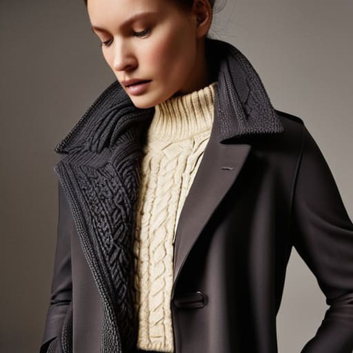
I was staring at a pile of “premium” charcoal knits in my studio last week, and honestly, it just made me angry. Everyone on social media acts like monochrome outfits are this effortless, high-fashion cheat code, but most of the time, you’re just paying a massive markup to look like a shapeless shadow. If you try to pull off a single-tone look using a cheap, low-GSM cotton tee paired with some flimsy synthetic trousers, you aren’t looking “minimalist”—you just look like you’re wearing unwashed laundry.
I’m not here to tell you which color is “in” for the season or how to follow a trend cycle that resets every three weeks. Instead, I want to talk about the actual mechanics of building a look that holds its shape. We’re going to dive into how to play with textural contrast and fabric weights so your layers actually stand out from one another. I’ll show you how to spot a quality weave from a mile away, ensuring your monochrome outfits look intentional rather than just accidental.
The High Cost of Ignoring Gsm in Tonal Dressing
The High Cost of Ignoring GSM in Tonal Dressing
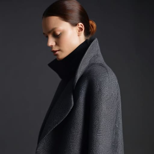
If you’re attempting styling tonal outfits using nothing but thrifted, paper-thin cotton, you’re going to run into a wall pretty quickly. When you strip away color variety, the weight of the fabric becomes the only thing providing structure. I’ve seen so many people try to pull off a neutral monochrome fashion look, only to end up looking like they’re wearing pajamas because the fabric lacks the density to hold a shape. If your base layer is a low-GSM flimsy tee, it’s going to drape like a wet napkin against your torso, completely ruining the intentional silhouette you were going for.
This is where the real magic happens: mixing textures in monochrome. To make a single-tone look actually work, you need to play with different weights. Pair a heavy, 300 GSM structured hoodie with a slightly lighter, brushed cotton trouser. That contrast in density is what prevents your all black outfit ideas from looking like a dark, shapeless blob. Without that variation in fabric heaviness, you aren’t dressing; you’re just wearing a single, uninspired layer of lint.
Mixing Textures in Monochrome to Avoid Looking Flat
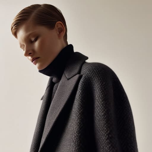
The biggest mistake I see when people try styling tonal outfits is treating every piece like it came from the same flat roll of fabric. If you pair a standard jersey cotton tee with basic cotton chinos in the same shade of charcoal, you aren’t wearing a look; you’re wearing a uniform that lacks any visual depth. It ends up looking like a silhouette with no soul. To actually make a single-tone look work, you have to stop thinking about color for a second and start thinking about how light hits the surface of the material.
This is where mixing textures in monochrome becomes your best friend. I’m talking about pairing a heavy, structured canvas work jacket with a soft, brushed fleece hoodie underneath. Or, if you’re leaning into all black outfit ideas, try a ribbed knit sweater against a smooth technical nylon pant. That contrast in tactile feel is what creates shadows and highlights, giving the eye something to actually latch onto. Without that interplay between matte and sheen, or rough and smooth, your outfit will always feel like a shapeless rag rather than a deliberate choice.
Five Ways to Stop Your Monochrome Look From Looking Like a Uniform
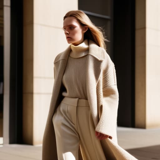
- Check the seam construction before you commit; if you’re wearing a single color, every crooked stitch or loose thread is going to be highlighted like a neon sign.
- Don’t ignore the wash; if you’re mixing a brand new black hoodie with a faded charcoal pair of trousers, it doesn’t look “intentional,” it just looks like you got dressed in the dark.
- Scale your accessories by weight; if you’re wearing a heavy 400 GSM fleece, a thin, flimsy silk scarf is going to look ridiculous and completely out of proportion.
- Use hardware as your “accent color”—since you aren’t using different hues, let the silver of a heavy zipper or the brass of a button do the heavy lifting to break up the visual monotony.
- Mind the silhouette or you’ll lose your shape entirely; when you strip away color contrast, you have to rely on structure (like a stiff collar or a tapered hem) to keep the clothes from just turning into one big, shapeless blob.
The Bottom Line on Tonal Dressing
Stop chasing the “aesthetic” of a single color if you haven’t checked the fabric weight; if your top and bottom have wildly different GSMs, the silhouette will look broken rather than intentional.
Use texture as your primary tool to create depth—think heavy cotton twill against a fine knit—otherwise, a monochrome outfit just looks like you forgot to finish getting dressed.
Invest in construction over branding; in a single-color look, every sloppy seam and cheap hem is magnified, so prioritize a clean finish that actually holds its shape.
Frequently Asked Questions
How can I tell if a garment's weight is actually high-quality or if it's just being marketed as "heavyweight"?
Don’t just trust the “heavyweight” tag on a website; that’s marketing fluff. You have to actually hold it. A real heavyweight piece should have some structural integrity—it should hold its own shape rather than just draping limply over your shoulders. If you can see the outline of your skin or an undershirt through the fabric when you hold it up to the light, it’s not high-GSM. It should feel substantial, not just thick.
If I'm mixing different fabrics like cotton and wool in one color, how do I stop them from looking like a mismatched mess?
It really comes down to the “finish” of the fabric. If you’re pairing a fuzzy wool sweater with a crisp cotton chino in the same navy, you need to make sure the color saturation is actually identical. I always check the dye lot if I can, but more importantly, look at how they catch light. If one is matte and the other is slightly sheen-heavy, the mismatch is obvious. Stick to similar light-absorption levels to keep it intentional.
Are there specific seam constructions I should look for so my monochrome pieces don't lose their shape after a few washes?
Look for flatlock stitching if you want something that actually holds its integrity, especially in knits. It lays flatter and handles tension way better than a standard overlock. Also, check for reinforced necklines—if there isn’t a clear taping or a double-needle topstitch around the collar, that monochrome piece is going to turn into a wavy mess after three washes. A good seam allowance isn’t just about comfort; it’s what keeps the silhouette from collapsing.