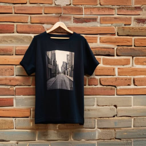
I was sitting in a cramped, humid shared studio last Tuesday, staring at a pile of “official” tour merch that felt more like plastic than fabric. It’s the same old story: a massive artist drops a collection, the hype goes nuclear, and suddenly everyone thinks a successful music and clothing crossover is just about slapping a high-res logo on a cheap, 140 GSM promotional tee. Honestly? It’s insulting. We’ve been conditioned to believe that if the artist wears it, the garment must be good, but I’ve spent enough time pulling threads to know that marketing is not craftsmanship.
I’m not here to talk to you about which aesthetic is going to trend on TikTok next week. Instead, I want to pull back the curtain on what actually makes these collaborations work—or fail miserably. We’re going to look past the branding and dive into the actual construction, from choosing blanks that won’t shrink into doll clothes after one wash to understanding why the weight of the fabric matters as much as the melody. If you want the truth about how to build something that people actually want to keep in their rotation, you’re in the right place.
Why Sonic Identity Through Fashion Trumps Viral Aesthetics
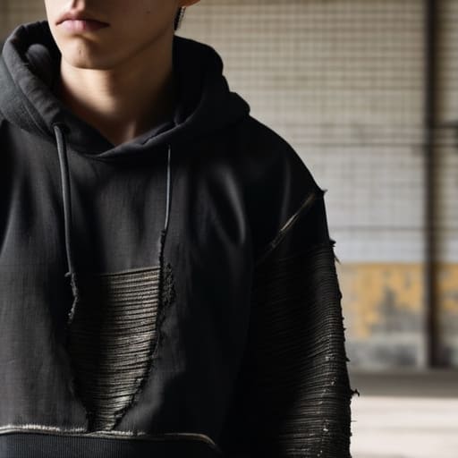
Look, I see it every single day on my feed: a brand drops a “vintage-inspired” graphic that looks like it was pulled straight from a Pinterest mood board, and within a week, it’s already landfill fodder. That’s not culture; that’s just chasing a ghost. When we talk about sonic identity through fashion, we aren’t talking about slapping a generic lightning bolt on a cheap Gildan tee because it “feels” punk. We’re talking about the way a specific subculture—the grit of early 90s jungle or the heavy, distorted weight of sludge metal—actually dictates the physicality of the clothes.
Real merchandise as cultural expression is about how a garment feels when you’re in a mosh pit or a dark club. If a band’s sound is massive and tectonic, but their artist branded apparel is a flimsy, thin-gauge cotton that loses its shape after one wash, the connection is broken. You can’t fake the soul of a movement with a viral aesthetic. You have to build the garment to match the frequency of the music, prioritizing the heavy-duty construction that a dedicated community actually respects.
The High Cost of Cheap Artist Branded Apparel
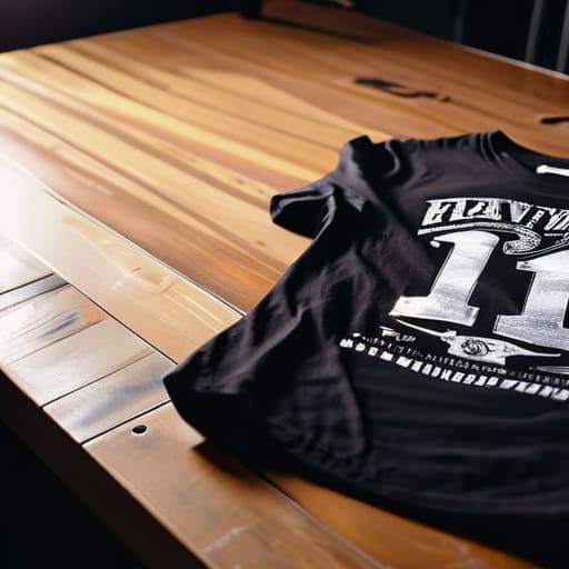
Look, we’ve all been there: you buy a shirt from a tour merch booth because the graphic is fire, only to have it shrink into a crop top after one wash or, worse, feel like you’re wearing a piece of sandpaper. This is the trap of low-quality artist branded apparel. When labels or artists prioritize quick margins over construction, they aren’t just selling a shirt; they’re selling a disposable souvenir. I’ve spent way too many hours in the studio deconstructing these “merch drops,” and it’s heartbreaking to see a killer design wasted on a 140 GSM blank that loses its shape before the encore is even over.
If you want your gear to actually function as merchandise as cultural expression, you have to respect the garment. Real streetwear and music subcultures are built on pieces that get worn, faded, and passed down—not thrown in a landfill because the side seams twisted. When the quality is garbage, the connection between the fan and the artist feels cheapened. You aren’t just buying a logo; you’re investing in a piece of that sonic identity, and that deserves a heavy-duty weave and a decent seam allowance.
How to actually build a merch line that doesn't end up in a landfill
- Stop chasing the “trending” silhouette. If you’re making gear for a specific sound, the weight of the fabric matters more than a baggy fit. A heavy, 300 GSM cotton tee feels like a piece of the culture; a thin, scratchy polyester blend feels like a souvenir you bought at a gas station.
- Check your seam allowances before you hit print. There is nothing worse than a killer graphic on a shirt that loses its shape after two washes because the side seams weren’t reinforced. If the construction is trash, the connection to the music dies with the first wash cycle.
- Prioritize the “lived-in” feel. Most of my favorite nineties band tees have survived decades because they were built to be worn, not just looked at. If you’re designing for a subculture, aim for durability—use high-quality blanks that can actually handle the grit of a concert pit.
- Don’t let the graphic do all the heavy lifting. A cool print on a bottom-tier garment is just marketing fluff. I’d rather see a simple, well-executed screen print on a premium, heavy-duty blank than a massive, over-complicated design on a shirt that feels like tissue paper.
- Think about the lifecycle of the garment. Real fans don’t just buy a shirt; they adopt it. If you want that crossover to actually mean something, design pieces that people want to keep in their rotation for years, not just something they wear once for the ‘gram and then toss.
The Bottom Line on Merch and Craft
Stop chasing the viral aesthetic if it means using a 140 GSM blank that feels like a paper towel; if the shirt dies after three washes, the artist’s brand dies with it.
Real connection happens when the tactile quality of the garment actually matches the weight of the music, not just when you slap a high-res logo on a cheap gildan.
Look past the marketing hype and check the seam allowance and the fabric weight—that’s where the actual value of “fan gear” lives.
Frequently Asked Questions
How can I tell if a band tee is actually a high-quality vintage reissue or just a cheap, thin reprint?
First, do what I do: turn it inside out. Check the seams. If it’s a real reissue, you’ll see sturdy, tight stitching, not those loose, single-needle threads that unravel after one wash. Then, feel the weight. A genuine vintage-feel blank should have some heft—look for a higher GSM. If it feels like a paper napkin or has that weird, plastic-y sheen, it’s just a cheap reprint masquerading as “retro.”
Does the weight of the fabric (GSM) actually affect how a graphic print holds up after a few washes?
Short answer? Absolutely. If you’re printing on a flimsy, low-GSM jersey, the fabric is going to stretch and warp the second it hits the wash cycle. Once that base layer loses its structural integrity, your graphic is going to crack or look like a distorted mess. A heavier, more stable GSM provides a consistent “canvas” that holds the ink in place. Don’t let a cheap blank turn a killer design into a wavy disaster.
What are the actual signs of good construction in artist merch beyond just a cool logo?
Look past the graphic. If you want to know if a piece is actually built to last, turn it inside out. I’m looking for clean seam allowances and no raw, fraying edges peeking through. Check the weight—a decent heavyweight tee should feel substantial, not flimsy. Look for double-needle stitching on the hems and a reinforced neck rib. If the construction is sloppy, that “limited edition” logo won’t save it from falling apart after three washes.