I remember sitting on a milk crate in a cramped, humid studio last summer, staring at a digital proof that looked absolutely nothing like the heavy-weight cotton hoodie sitting in my lap. The brand had sent over this glossy, over-edited PDF that promised “effortless luxury,” but it was all smoke and mirrors. It’s a massive pet peeve of mine when people treat lookbooks and their purpose as nothing more than a way to sell a lifestyle through expensive lighting and heavy filters. If the photography is doing all the heavy lifting to hide the fact that your seam allowance is non-existent or your drape is trash, you aren’t building a brand—you’re just hiding the truth.
I’m not here to teach you how to hire a high-fashion photographer or how to chase whatever aesthetic is trending on TikTok this week. Instead, I want to pull back the curtain on how a lookbook can actually serve as a technical blueprint for your garments. We’re going to talk about how to use these visuals to show off the real integrity of your construction, from the way a heavy GSM fabric hangs to the way a specific wash catches the light. No hype, just the actual utility of visual storytelling.
Visual Storytelling in Fashion Moving Beyond the Surface
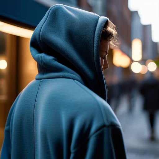
When I’m staring at a new sample on my cutting table, I’m not just looking at the silhouette; I’m thinking about how that fabric is going to behave under a lens. This is where visual storytelling in fashion actually matters. It’s easy to snap a photo of a hoodie against a white wall, but that tells you nothing about the life of the garment. A real lookbook uses imagery to communicate how the weight of a 400 GSM fleece actually moves when someone is walking through a city or sitting in a dimly lit cafe.
You aren’t just selling a piece of fabric; you’re building a brand identity through imagery that proves your clothes belong in a specific world. If your shots are too polished and sterile, you lose that raw, tactile connection that makes people actually want to touch the material. I’ve seen so many brands chase a generic “aesthetic” only to realize they’ve completely stripped the soul out of their craft. You want your audience to feel the texture of the weave and the intentionality of the stitch through the screen, not just see another filtered outfit.
Brand Identity Through Imagery More Than Just Pretty Pictures
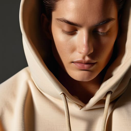
When I first started printing tees in that cramped shared studio, I thought a good photo was just about having a decent camera and a model who didn’t look bored. I was wrong. A lookbook is actually the backbone of your brand identity through imagery; it’s the difference between looking like a bedroom project and a legitimate label. If your garments have a specific weight or a certain way they drape—say, a heavy 300 GSM fleece—your imagery needs to communicate that texture. If the lighting is flat and the vibe is generic, people won’t feel the quality, no matter how much you claim it in the captions.
It’s also about how you bridge the gap between a garment and a lifestyle. You aren’t just selling a piece of fabric; you’re curating an entire world that people want to inhabit. Whether you’re leaning into a gritty, lo-fi aesthetic or something hyper-polished, every shot is a data point for your customer. They aren’t just looking at clothes; they are looking for cues on how to exist within your brand’s universe.
Stop Chasing Aesthetics and Start Showing the Build
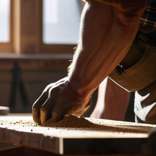
- Show the drape, not just the vibe. If you’re selling a heavy 400 GSM hoodie, your lookbook needs to show how that fabric actually sits on a shoulder. A flat, studio shot won’t tell me if the weight is there; movement and shadow will.
- Detail shots are non-negotiable. I’m tired of seeing “premium” collections where I can’t even see the stitching. Use your lookbook to zoom in on the grain of the fabric or the way a seam is finished. If you’re proud of the construction, prove it.
- Lighting is a technical tool, not just a mood setter. Don’t let a heavy filter hide the actual colorway of the garment. If I order a forest green tee and it shows up as a muddy charcoal because your lookbook was too moody, you’ve already lost me.
- Contextualize the fit. A model standing stiffly in a white room tells me nothing about how a garment lives. Show the garment in a way that communicates its silhouette—whether it’s an oversized boxy cut or a slim, structured drape.
- Consistency is your quality control. If your lookbook jumps from high-gloss editorial to grainy lo-fi iPhone shots without a clear reason, it looks like your production quality is just as inconsistent. Use your imagery to signal that your manufacturing is intentional.
The Real Utility of a Lookbook
A lookbook isn’t just a way to flex a vibe; it’s the most honest way to show how a garment actually moves, drapes, and holds its shape when it’s not just hanging on a sterile studio rack.
Stop treating imagery like a marketing mask; use your lookbook to prove the technical details—like the weight of the fabric or the way a seam sits—so your customers know they aren’t just buying a logo.
Think of your lookbook as a blueprint for brand integrity, bridging the gap between a high-concept mood board and the actual, physical reality of the clothes you’ve spent months perfecting.
Frequently Asked Questions
If I'm just starting out with a small run, do I actually need a professional lookbook, or can I just get good shots on my phone?
Look, I get it. When you’re burning your budget on high-GSM blanks and custom dyes, a professional shoot feels like a massive luxury. But here’s the thing: you don’t need a $5k production, but you do need intentionality. A blurry, poorly lit iPhone shot tells a buyer you don’t care about the details. If you go the phone route, nail the lighting and show the construction—the seams, the drape, the texture. Quality is non-negotiable.
How can I use a lookbook to show off technical details like stitch density or fabric weight without it looking like a boring spec sheet?
Stop thinking of it as a technical manual and start thinking of it as a macro lens. You don’t need a spreadsheet; you need a tight, high-res shot of a double-needle topstitch or the way a heavy 400 GSM fleece holds its shape at the cuff. If the light hits the grain of the fabric just right, people will feel the weight through the screen. Show the tension, the drape, and the reality of the construction.
Is there a way to balance the "vibe" of a lookbook so it doesn't end up masking poor construction or bad garment silhouettes?
Honestly, this is where the “vibe” becomes a trap. If you’re using heavy grain, weird lighting, or extreme angles just to hide a wonky shoulder or a hem that puckers, you’re lying to your customers. A good lookbook should prove the silhouette holds its shape even when it’s moving. Use some clean, medium shots to show how the fabric actually drapes. If the construction can’t survive a decent light, the “aesthetic” is just a mask.