I remember sitting in my first shared studio, surrounded by the smell of plastisol ink and half-finished screen prints, staring at a website that looked like a million bucks but felt like nothing. The owner had spent a fortune on a high-end studio shoot, yet when I actually touched the garments, the vibe was completely disconnected from the imagery. It’s this weird gap that trips everyone up: they think photography and brand identity is just about buying a fancy camera or hiring a model with a certain aesthetic. But if your photos are screaming “luxury” while your construction is screaming “fast fashion,” you aren’t building a brand—you’re just lying to your customers.
I’m not here to tell you which expensive lens will make your studio look more professional or how to chase the latest Instagram filter. Instead, I want to talk about how to make sure your visuals actually respect the work you put into your patterns and textiles. We’re going to look at how to align your visual language with the actual soul of your garments, so your customers feel the quality through the screen before they even touch the fabric.
Mastering Visual Brand Language Over Fleeting Trends

Look, I get it. You see a certain lighting style or a specific grainy filter blowing up on TikTok, and suddenly you feel like you need to pivot your entire look to stay relevant. But chasing every micro-trend is exactly how you end up with a brand that feels like a fast-fashion clearance rack—disposable and forgettable. Instead of playing whack-a-mole with what’s “in” this week, you should be focusing on your visual brand language. This isn’t about being trendy; it’s about deciding what your brand actually says when no one is talking.
Think of it like choosing a fabric weight. You don’t pick a heavy French terry just because it’s popular; you pick it because it matches the structure and intention of the garment. Your brand aesthetic development needs that same level of intentionality. Whether you’re using harsh, high-contrast shadows or soft, natural light, every choice should reinforce your core identity. If your goal is to showcase the rugged durability of a workwear line, don’t use soft-focus, dreamy presets. Consistency is what builds trust, and trust is what keeps people coming back long after the trend cycle has moved on.
The High Cost of Inconsistent Brand Aesthetic Development
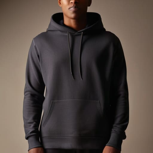
Look, I’ve seen it a hundred times in the studio: a brand spends six months perfecting a heavy-weight French Terry hoodie, only to launch it with a mix of iPhone shots, some overly filtered studio snaps, and a random grainy film photo that feels like it belongs to a different company entirely. When your brand aesthetic development is all over the place, you aren’t just looking messy—you’re actively leaking trust. If I can’t tell if you’re a luxury minimalist label or a gritty underground skate brand because your feed looks like a junk drawer, I’m not going to trust your construction.
Inconsistency acts like a bad seam allowance; it might look okay from a distance, but the second someone looks closer, the whole thing starts to unravel. Without a solid brand photography strategy, you’re essentially asking your customers to do the heavy lifting of figuring out who you are. You shouldn’t have to explain your vibe through a caption because your photos didn’t do the work. If your imagery doesn’t feel intentional, people will assume your manufacturing is just as haphazard.
Stop Treating Your Lookbook Like a Mood Board
- Stop chasing every Pinterest aesthetic that pops up. If you switch from grainy film to hyper-clean digital every three months, your customers won’t know what you actually stand for. Pick a visual language—even if it’s a bit niche—and stick to it until the seams feel solid.
- Lighting is just as important as your fabric weight. You can have the most incredible 300 GSM heavyweight cotton in the world, but if your lighting is flat and washed out, that texture is going to look like cheap, thin jersey. Use shadows to show the grain of the fabric.
- Show the guts of the garment. I’m tired of seeing “lifestyle” shots that only show the front of a hoodie. If you’re proud of your construction, photograph the double-needle stitching, the way the ribbing sits, and the interior finish. Real craft deserves more than a single angle.
- Consistency isn’t about being perfect; it’s about being recognizable. Whether you’re shooting on a street corner or in a studio, the color grading and the “vibe” should feel like they belong to the same family. If your Instagram looks like a random junk drawer, your brand won’t feel premium.
- Context matters more than high resolution. A blurry photo can actually work if it fits your brand’s grit, but a sharp photo of a poorly constructed garment is just a high-definition way of showing people why they shouldn’t buy from you. Make sure the quality of the image matches the quality of the stitch.
The Bottom Line for Your Brand
Stop chasing the latest TikTok aesthetic; if your visuals don’t match the actual quality of your garments, you’re just building a house of cards that’ll collapse the second a customer touches your fabric.
Consistency isn’t about being perfect, it’s about being recognizable—you want people to feel the same vibe from your Instagram feed as they do when they unbox a heavy-weight hoodie.
Treat your photography like your pattern cutting: if the foundation is sloppy and inconsistent, no amount of “hype” or clever marketing is going to fix the structural failure of your brand identity.
Frequently Asked Questions
How do I figure out if my photography actually reflects the quality of my garments, or if I'm just masking poor construction with cool lighting?
The easiest way to tell? Flip the garment inside out. If your lighting is doing all the heavy lifting to hide puckered seams or uneven hems, you aren’t selling quality—you’re selling a vibe. Look at your close-ups. If you’re focusing on shadows and “mood” to avoid showing the actual stitch density or the way the fabric drapes, you’re masking. If the construction doesn’t look solid under a harsh, unedited light, no amount of grain is saving it.
Is it worth investing in professional studio shots right away, or can I build a real brand identity just using a decent phone and natural light?
Look, I’ve seen brands launch with nothing but iPhone shots in a sunlit backyard, and honestly? They look more authentic than some over-produced studio nonsense. If your lighting is clean and your compositions aren’t messy, a phone is plenty. Don’t blow your entire production budget on a photographer before you’ve even perfected your patterns. Invest in the garment first; as long as the texture and fit are visible, the “vibe” will follow.
How do I keep my visual style consistent without making my whole feed look like a repetitive, boring catalog?
Think of it like a garment: you need a solid base, but that doesn’t mean every piece is the same color. Stop trying to match every single photo to one exact filter. Instead, pick a “fabric” for your brand—maybe it’s harsh lighting and gritty textures, or soft shadows and natural tones. Use those consistent elements as your thread, then vary the “pattern” through different angles, crops, and subjects. Consistency is a vibe, not a template.