I still remember the first time I tried to launch my own little line in that cramped, shared studio—the smell of plastisol ink was so thick I could practically taste it, and my hands were stained a permanent, stubborn shade of cobalt. I had spent weeks obsessing over a “professional” setup I’d seen online, only to realize that most of the tutorials out there are just high-gloss marketing fluff designed to sell you expensive, unnecessary gear. If you’re looking for a magical, one-click solution to high-end apparel, you’re in the wrong place; I’m here to give you screen printing explained without the gatekeeping or the nonsense.
I’m not going to bore you with the history of printing from the Han Dynasty or whatever. Instead, I’m going to tell you what actually happens when the squeegee hits the mesh and why your ink might end up feeling like a piece of stiff cardboard if you don’t respect the chemistry. We’re going to talk about real technicalities—the stuff like mesh counts, emulsion stability, and why your choice of garment blank matters more than the design itself. My goal is to pull back the curtain so you can stop wasting money on mistakes and start making clothes that actually last.
Why Mesh Count for Different Fabrics Changes Everything
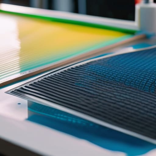
Here is the thing about mesh count: it’s not just a number on a piece of silk; it’s the difference between a crisp design and a muddy mess. If you’re trying to push a high-detail, fine-line illustration through a low-mesh screen, you’re basically asking for a disaster. A lower mesh count lets more ink through, which is great if you’re printing heavy, opaque white on a black hoodie, but it’ll absolutely drown your details. You need that finer mesh to control the flow, especially during the emulsion coating process, to ensure your stencil is sharp enough to actually hold the shape you intended.
It really comes down to how the ink interacts with the weave. If you’re working with a super smooth, tight-knit jersey, a high mesh count allows for that surgical precision. But if you’re hitting a heavy, textured canvas, you might actually need a coarser mesh to get the ink to sit right. I’ve seen so many people obsess over their types of screen printing inks without realizing that their mesh choice is actually the bottleneck. You can have the most expensive pigment in the world, but if your mesh is wrong for the fabric, it’s just expensive wasted effort.
The Truth About Types of Screen Printing Inks
Look, once you’ve actually mastered your emulsion coating process and got your stencils looking sharp, you’re going to hit a wall: the ink. Everyone thinks “ink” is just one thing, but choosing the wrong types of screen printing inks is the fastest way to turn a premium blank into something that feels like wearing a sheet of plastic.
If you’re going for that vintage, soft-hand feel—the kind you find on those faded nineties band tees I collect—you want plastisol with a high additive mix or, even better, water-based inks. Water-based is the real deal; it sinks into the fibers rather than sitting on top, but it’s temperamental as hell. It dries in the screen if you aren’t careful, which can totally wreck your workflow.
On the flip side, plastisol is the industry workhorse because it’s predictable and stays exactly where you put it. It’s much more forgiving if your squeegee technique for beginners is a bit shaky, but if you use too much, you lose that breathable, high-quality texture. You have to decide if you’re printing for durability or for that lived-in, authentic feel.
Five things they don't tell you in the YouTube tutorials
- Stop obsessing over the design and start looking at the fabric weight. If you’re trying to print a heavy, high-opacity white ink on a flimsy, low-GSM jersey, it’s going to feel like a literal piece of cardboard stuck to your chest. Match your ink thickness to your blank’s weight or you’ll ruin the drape of the shirt.
- Don’t get seduced by “easy” water-based inks if you aren’t ready for the cleanup. They feel incredible—super soft, almost part of the fabric—but if you let them sit on your mesh for even ten minutes too long without a stabilizer, they’ll dry right into the screen and turn your expensive mesh into trash.
- Check your registration before you commit to a full run. I’ve seen so many people rush into a hundred-shirt print only to realize their second color is sitting two millimeters off from the first. It doesn’t matter how cool the art is; if the alignment is wonky, it just looks like a cheap mistake.
- The “secret” to a professional finish isn’t just the print; it’s the cure. If you don’t hit that ink with enough heat for long enough, it’s going to crack the second someone puts it through a standard wash cycle. Don’t trust a “looks dry” assessment—use a thermometer.
- Always, always do a test print on a scrap piece of the actual fabric you’re using. Every blank reacts differently to moisture and tension. What looks perfect on a white cotton swatch might bleed like crazy on a heavy poly-blend. Spend the extra twenty minutes to test it first so you don’t waste a whole box of blanks.
The Bottom Line: What Actually Matters
Stop chasing the newest ink trend or the flashiest print style until you’ve actually matched your mesh count to your fabric weight; if the technical foundation is off, the print is going to look like a mess regardless of how much you spent on it.
Don’t let a “cool” design mask a garbage blank—if you’re printing high-end art on a low-GSM shirt that’s going to shrink into a crop top after one wash, you’re just helping a fast-fashion cycle that I’m trying to break.
Real quality lives in the details you can’t see at first glance, like how the ink sits in the fibers and whether the seam allowance can actually handle the tension of the print.
Frequently Asked Questions
If I'm printing on a heavy, high-GSM streetwear blank, do I need to change my squeegee pressure or my ink type to keep the print from feeling like a literal sheet of plastic?
If you’re working with a heavy, high-GSM blank, you’ve already done the hard part by picking a decent base. Don’t ruin it with a thick, plasticky layer of ink. Switch to a water-based or discharge ink if you can—it sinks into the fibers instead of sitting on top. As for the squeegee, don’t just mash it down. Use firm, consistent pressure to ensure the ink hits the weave without flooding the screen.
How do I figure out if a garment is actually worth the price tag based on the seam allowance and construction, rather than just the print quality?
Stop looking at the graphic and start looking at the guts. I always flip my garments inside out first—that’s where the truth is. Check the seam allowance: if it’s a tiny, raw edge, it’s going to fray and warp after three washes. You want generous, clean seams and reinforced stitching at the stress points. If the construction looks rushed or flimsy, that “premium” print is just a mask for a garment that won’t last.
Is it actually possible to screen print on vintage-style, faded tees without the ink cracking or making the fabric feel too stiff?
Honestly, it’s a huge headache if you don’t do it right. If you’re working with those thin, lived-in blanks I love, heavy plastisol is your enemy—it’ll feel like a piece of cardboard glued to your chest. You want to go with water-based inks or discharge printing. Discharge actually bleaches the dye out of the fabric and replaces it with color, so you get that soft, zero-hand feel that makes it look like it’s been washed a hundred times.