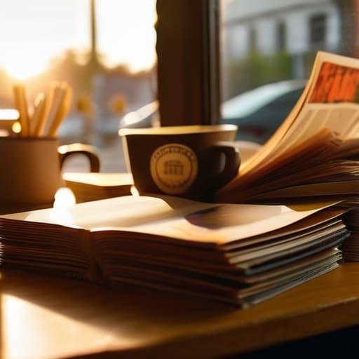
I still remember the first time I held a heavy-stock indie zine in my hands at a tiny studio pop-up; the smell of fresh soy ink and that specific, slightly toothy texture of the paper felt more real than anything on my phone screen. Nowadays, everyone talks about the “death” of print, but they’re usually looking at it through a lens of nostalgia rather than substance. To me, the conversation around magazines and printed culture shouldn’t be about some romanticized longing for the past, but about the actual, tactile physics of the medium—the way a certain paper weight changes how you digest a layout or how a high-quality binding keeps a collection from falling apart after three reads.
I’m not here to sell you on the “aesthetic” of print or give you a lecture on why digital is inferior. Instead, I want to pull back the curtain on the physicality of the medium. I’m going to break down what actually makes a publication feel substantial versus what’s just cheap, porous stock masquerading as art. We’re going to talk about paper GSM, ink saturation, and why the way a magazine is constructed is just as important as the photography inside it.
The Tactile Reading Experience Why Texture Outlasts a Pixel
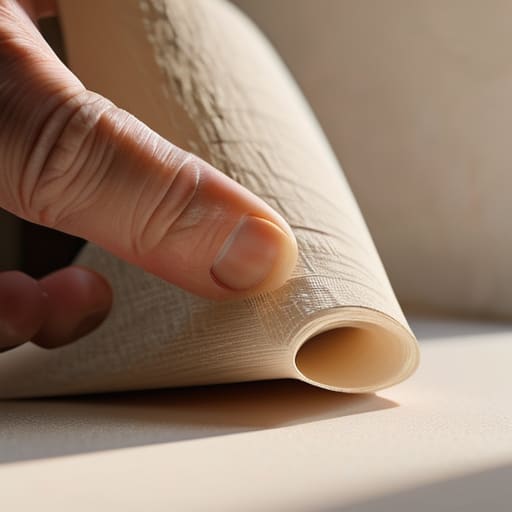
There is a specific, heavy satisfaction in turning a page that a scroll bar just can’t replicate. When I’m working in the studio, I’m constantly thinking about how a fabric drapes or how a heavy cotton holds a screen print, and I find myself applying that same logic to paper. In the current print vs digital media landscape, we’ve been conditioned to think that “content” is just something we consume through a glass pane. But a magazine isn’t just data; it’s an object. There is a massive difference between clicking a link and feeling the tooth of a matte, uncoated stock under your thumb.
That tactile reading experience is exactly why we’re seeing such a weird, beautiful resurgence in small-run zines. You can’t “feel” the quality of a digital layout. You can’t smell the ink or appreciate the way a thick, high-GSM cover stock gives a publication a sense of permanence. When you hold a physical issue, you aren’t just consuming information; you are interacting with a piece of craftsmanship. That physical weight tells your brain that whatever is printed on these pages actually matters.
Paper Stock and Ink Saturation the Aesthetic of Physical Publications
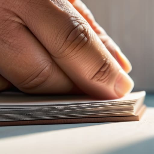
When I’m looking at a new zine or a high-end periodical, I’m doing exactly what I do with a vintage tee: I’m checking the weight. You can tell immediately if a publisher actually cares about the craft or if they just outsourced the cheapest possible production to save a buck. There is a massive difference between a flimsy, uncoated paper that feels like a grocery flyer and a heavy, toothy stock that actually holds the ink. In the current print vs digital media landscape, that physical resistance—the way the paper fights back against your thumb—is everything.
If the ink is bleeding into the fibers because the GSM is too low, the whole visual language falls apart. I’ve seen so many indie projects fail because they prioritized a flashy layout but ignored the material reality of the page. High ink saturation on a premium, matte stock creates a depth that a backlit screen simply cannot replicate. This obsession with the aesthetic of physical publications is exactly why we’re seeing such a massive surge in niche, small-run printing; people aren’t just buying content anymore, they’re collecting objects.
Don't Let Your Print Run Feel Like a Cheap Promotional Flyer

- Stop defaulting to the standard 80gsm bond paper. If you’re making a zine or a high-end mag, that thin, flimsy stock makes your content feel disposable. Go for something with a bit of tooth—a heavier weight that actually feels substantial when someone picks it up.
- Watch your ink absorption. There is nothing worse than spending weeks on a layout only to have the ink bleed into the fibers and turn your crisp typography into a blurry mess. Test your swatches on the actual stock you’re buying before you commit to a full run.
- Think about the binding, not just the pages. A staple-bound saddle stitch is fine for a quick DIY zine, but if you’re trying to build something that people actually want to keep on their coffee tables, look into perfect binding. It gives the spine that clean, professional edge that screams “this isn’t just a pamphlet.”
- Respect the margins and the gutter. I see so many indie publications lose their text in the fold because they didn’t account for the binding depth. If your text is disappearing into the crease, you haven’t mastered the craft; you’ve just made a paperweight.
- Choose a finish that serves the art, not just the trend. High-gloss can look cheap and reflect light in a way that makes reading a nightmare. If you want something that feels elevated and intentional, a matte or uncoated finish usually lets the color saturation do the heavy lifting without the tacky glare.
The Bottom Line on Print
Stop treating paper like an afterthought; the GSM and finish you choose dictate whether a magazine feels like a collector’s piece or something destined for the recycling bin.
Ink isn’t just color—it’s a physical layer, and choosing the right stock ensures your visuals actually pop instead of sinking into a porous, cheap-feeling surface.
In a world of infinite scrolling, the physical weight and texture of a publication are what actually force a reader to slow down and engage.
Frequently Asked Questions
Does the type of paper stock used actually change how much I'll retain from the articles I'm reading?
It sounds like a bit of a stretch, but honestly? Yeah, it does. If I’m reading a flimsy, high-gloss flyer, my brain treats it like junk mail—it’s just scanning for data. But when you’re holding a heavy, uncoated stock with a bit of tooth, the tactile feedback anchors you. It turns reading from a passive scroll into a physical task. You’re more likely to actually digest the content when the medium demands your attention.
If I'm looking to start my own niche zine, how much does the ink absorption rate matter for high-contrast photography?
It matters immensely. If you’re running high-contrast photography, you’re dealing with deep blacks and sharp highlights. If you use a cheap, uncoated stock with a high absorption rate, that ink is going to bleed into the fibers like a sponge. Your blacks will look muddy and your edges will lose their bite. You need a paper with a tighter surface—something that holds the pigment on top rather than swallowing it—so those shadows actually stay crisp.
Is there a way to tell if a magazine is using cheap, recycled pulp that's going to yellow and fall apart in a year?
Honestly, just grab the edge of a page and give it a little tug. If it feels fuzzy or “hairy,” you’re looking at high-lignin, cheap pulp. Lignin is the culprit that turns everything that sickly yellow color as it oxidizes. I always check the opacity too; if you can see the text from the next page bleeding through like a ghost, that’s a sign of low-density, recycled stock that’s going to crumble by next season.